Welcome, Guest
Username: Password: Remember me
Report any technical problems you discover and discuss solutions.
  • Page:
  • 1
  • 2

TOPIC:

Setting up MediaElementJS elements responsively 5 years 8 months ago #5264

  • Joel-Xhibit
  • Joel-Xhibit's Avatar Topic Author
  • Offline
  • New Member
  • New Member
  • Posts: 11
  • Thank you received: 1
Hi All,

I’m currently working on a XOT project which features lots of video content and I’ve been attempting to optimise the responsive delivery of the MediaElementJS video player, which forms a key component of the existing 'Media > Video' XOT template.

I’m unsure whether any additional development work has been carried out recently on the ‘Video’ template for the forthcoming ‘Xerte X’ release, but I’ve found the MediaElementJS video player to be a particularly troublesome component to deal with.

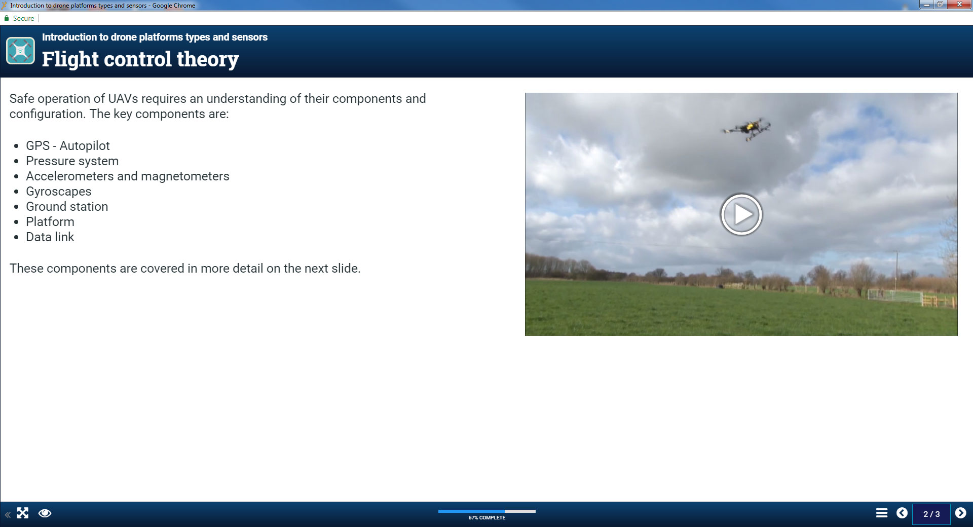
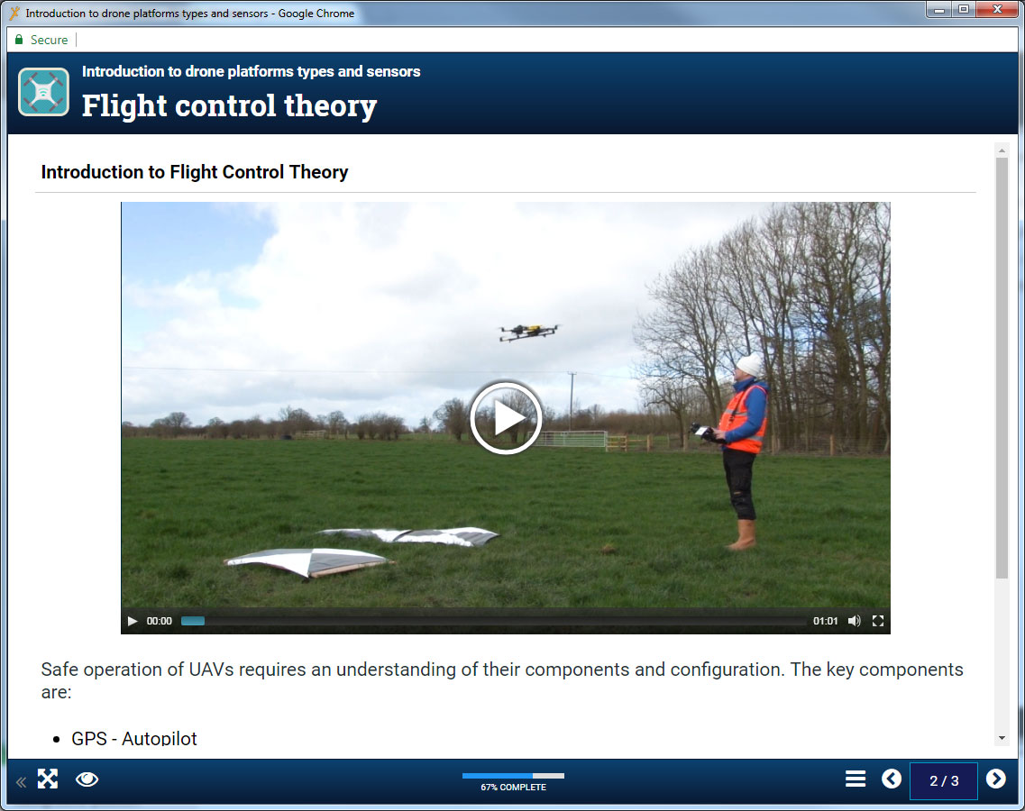
I’ve uploaded my custom-made video, which is setup at 854x480 in MP4 format, into the ‘Video’ template (see attachment 1) and I have set the ‘iframe Aspect Ratio’ and ‘Video Size’ optional properties to ‘16:9’ and ‘854,480’ respectively. I have also introduced the ‘Styles’ optional property into my template and I’ve then attempted to adapt the super-useful code supplied by Neil Gee and Andreas Orphanides .

However, I’m really struggling to get this working optimally in XOT and I’m wondering whether anyone else has managed to crack this before? One of my main problems is the ‘Video Size’ optional property. By specifying two specific values, as I have done, these are being passed directly inline as ‘style’ properties on my video component and overriding these with percentage (fluid) values (through the ‘Styles’ optional property) suddenly starts to become more complicated (and an !important fest).

In Andreas’ code example, the key to this appears to be setting the width of the player to 100% and the height to an ‘auto’ value:
/* These declarations force the video element to resize with the browser. */
.videoContainer .mejs-container.svg.mejs-video,
.videoContainer .mejs-overlay.mejs-layer.mejs-overlay-play,
.videoContainer .mejs-poster.mejs-layer,
.videoContainer .mejs-captions-layer.mejs-layer,
.videoContainer video {
     margin: 0 !important;
     text-align: center;
     width: 100% !important;
     height: auto !important;
}

I've managed to follow Andreas' advice and my video now resizes responsively to fill 100% of the screen width, but the height of the player is where I keep encountering issues. I just can't seem to incorporate the 'auto' property properly and the player is stuck with a height of over 400px.

Here is an overview of the approach used so far:
.panel.inline.x_floatRight {
    width: 100%;
    -moz-box-shadow: none;
    -webkit-box-shadow: none;
    box-shadow: none;
}

/* These declarations force the MediaElement JS video elements to resize with the browser. */
.mejs-container.svg.mejs-video,
.mejs-overlay.mejs-layer.mejs-overlay-play,
.mejs-poster.mejs-layer,
.mejs-captions-layer.mejs-layer, video {
   width: 100% !important;
}

I don't think I'm far away from getting this sorted? I would like to expand the Video template in the future to have further customisable options, including the ability to upload a custom thumbnail (poster) image.


Attachments:

Please Log in or Create an account to join the conversation.

Setting up MediaElementJS elements responsively 5 years 8 months ago #5265

  • ronm
  • ronm's Avatar
  • Offline
  • Administrator
  • Administrator
  • Posts: 843
  • Thank you received: 245
Hi Joel
a quick reply/suggestion - try using the media lesson page instead?
Tom did a lot of work on that a while back and you don't have to create interactive pages with that page type. Worth a try anyway.

I suspect the reason it's not working when you're trying to set the height via css is that the height is changed via js/jquery rather than just css. Or perhaps the container that the media element is sitting in. For that matter try the plain text page and add your own rather than using the video page.

HTH
Ron
Xerte developer & trainer
e-learning & m-learning consultant
mitchellmedia.co.uk | xerteacademy.com | learningapps.co.uk
Note: Support here is voluntary and meant for users to support each other.
Need direct commercial support with Xerte? mitchellmedia.co.uk/contact/
The following user(s) said Thank You: Joel-Xhibit

Please Log in or Create an account to join the conversation.

Setting up MediaElementJS elements responsively 5 years 8 months ago #5266

  • Joel-Xhibit
  • Joel-Xhibit's Avatar Topic Author
  • Offline
  • New Member
  • New Member
  • Posts: 11
  • Thank you received: 1
Thanks for the advice Ron - I hadn't thought about using the 'Media Lesson' template page, but as you rightly pointed out, this has allowed me to include video responsively in my project (see screenshots attached). Some really good work completed by Tom there and it would be great to see this functionality pulled across into the 'Video' template too at some later stage in the future.

Best Regards,

Joel


Attachments:

Please Log in or Create an account to join the conversation.

Setting up MediaElementJS elements responsively 5 years 8 months ago #5267

  • ronm
  • ronm's Avatar
  • Offline
  • Administrator
  • Administrator
  • Posts: 843
  • Thank you received: 245
Hi Joel
the point is now you also have the option if you wish to change/synchronise content with the video and/or add interactions or assess learning. The plain video page doesn't offer that flexibility.
Cheers
Ron
Xerte developer & trainer
e-learning & m-learning consultant
mitchellmedia.co.uk | xerteacademy.com | learningapps.co.uk
Note: Support here is voluntary and meant for users to support each other.
Need direct commercial support with Xerte? mitchellmedia.co.uk/contact/

Please Log in or Create an account to join the conversation.

Setting up MediaElementJS elements responsively 5 years 8 months ago #5268

  • Joel-Xhibit
  • Joel-Xhibit's Avatar Topic Author
  • Offline
  • New Member
  • New Member
  • Posts: 11
  • Thank you received: 1
Agreed completely Ron. This template will be perfect for presenting our learners with follow up MCQs based around what they've just watched in the video clips.

For anybody interested in specifying a 'poster' image for their video, which works similarly to the custom thumbnail images used on YouTube videos, I was able to specify my own custom thumbnail - in this case a drone operator (see attached) - by introducing the following CSS code via the 'Styles' optional property in the 'Media Lessons' template:
.mejs-poster {
   background-image: url("REPLACE WITH THE URL PATHWAY TO YOUR CUSTOM IMAGE") !important;
   display: block !important;
}

The use of the !important tags overrides the default styling properties used in the MediaElementJS video player. I uploaded a high-resolution image (taken from my video) into the XOT Media Browser area and then right-clicked on my image (within the Media Browser) and selected the 'Get Info' option in order to find the full URL pathway to my image (see attached). As I mentioned before, I'd be keen to introduce 'Poster Image', as an additional 'Optional Property' in the future, complete with a file picker, but that will tide people over for now.
Attachments:

Please Log in or Create an account to join the conversation.

Setting up MediaElementJS elements responsively 5 years 5 months ago #5438

  • ymoore
  • ymoore's Avatar
  • Offline
  • Administrator
  • Administrator
  • Posts: 94
  • Thank you received: 6
Hi Joel
I've been trying to implement your example (of creating a poster image for a video in the Media Lesson page) and it works in terms of displaying my poster image. However, when I play the video I can hear the audio but not see the footage - the poster image stays in place. Is there another step needed?

Thanks

Yvonne

Please Log in or Create an account to join the conversation.

  • Page:
  • 1
  • 2
Moderators: ronmjultenJohnSmith
Time to create page: 0.099 seconds
Copyright © 2024 The Xerte Project.
Xerte logo Apereo logo OSI Logo

Search