xot_side_bar
This is an old revision of the document!
Table of Contents
Project-level Optional Property: Side Bar
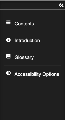
The XOT Side Bar is an optional property which can be applied at project level. Its function is to replace some of the buttons normally found in the footer with a collapsible menu placed to the side of the project interface. The Side Bar can contain text information on the buttons which is not possible in the footer. This can help draw the viewer's attention to key features, such as Accessibility options, which may otherwise be missed. Its collapsible state allows it to be removed when the viewer wants to concentrate on the main content of the resource.
Editor Interface
Properties
| Property | Sub-property | Description | Type | Additional information |
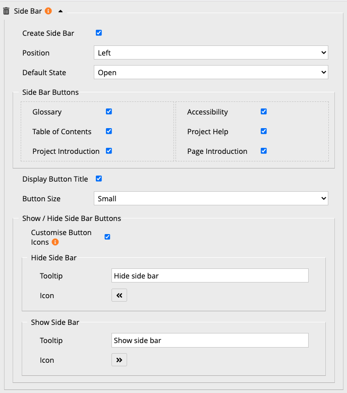
| Create Side Bar | When checked the Side Bar properties are displayed. | Tick box | ||
| Position | Where the Side Bar is positioned in the learning object {Left/Right} | Drop-down | ||
| Default State | Whether the Side Bar is displayed or collapsed when the learning object is viewed. {Open/Closed} | Drop-down | ||
| Display | {Table of Contents/Interface buttons} | Drop-down | Table Contents gives links to each page; Interactive Buttons just displays the footer buttons (but not the navoiagtion buttons) | |
| Side Bar Buttons | Glossary, Table of Contents, Project Introduction, Page Resources, Accessibility, Project Help, Page Introduction | Select which buttons to display in the Side Bar. | Tick boxes |  These properties are only visible if Interface Buttons is selected as the Display option. Any buttons not selected for the Side Bar will remain visible in the footer. These properties are only visible if Interface Buttons is selected as the Display option. Any buttons not selected for the Side Bar will remain visible in the footer. |
| Button Title | When selected the buttons will display the relevant text as well as an icon. | Tick box |  This property is only visible if Interface Buttons is selected as the Display option. When not selected only the icons will display. A tooltip will display when the mouse hovers over the icon, with the relevant text. This property is only visible if Interface Buttons is selected as the Display option. When not selected only the icons will display. A tooltip will display when the mouse hovers over the icon, with the relevant text. |
|
| Button Size | The size of the buttons displayed in the Side Bar. {Small/Large} | Drop-down |  This property is only visible if Interface Buttons is selected as the Display option. This property is only visible if Interface Buttons is selected as the Display option. |
|
| Show/Hide Side Bar Buttons | Position | {Top/Left} Allows you to choose the position of the button that expands and collapses the Side Bar. | Drop-down | |
| Customise Button Icons | Allows you to customise the Show and Hide Side Bar buttons | Tick box | When this box is ticked, additional fields are displayed for the following 2 sub-properties, allowing you to change the default icons. | |
| Hide Side Bar: Tooltip | The text displayed when you hover over the button | Text | ||
| Show Side Bar: Tooltip | The text displayed when you hover over the button | Text | ||
| Optional logo | Image | Adds an image to the top of the Side Bar | Link to Media Browser | |
| Description | Description for accessibility | Text | ||
Example
xot_side_bar.1761298187.txt.gz · Last modified: by jsmith


